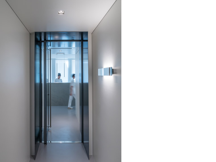
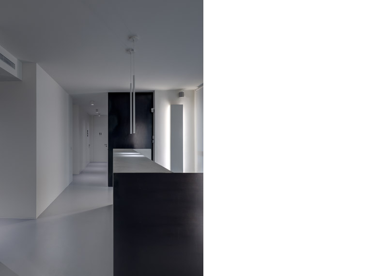
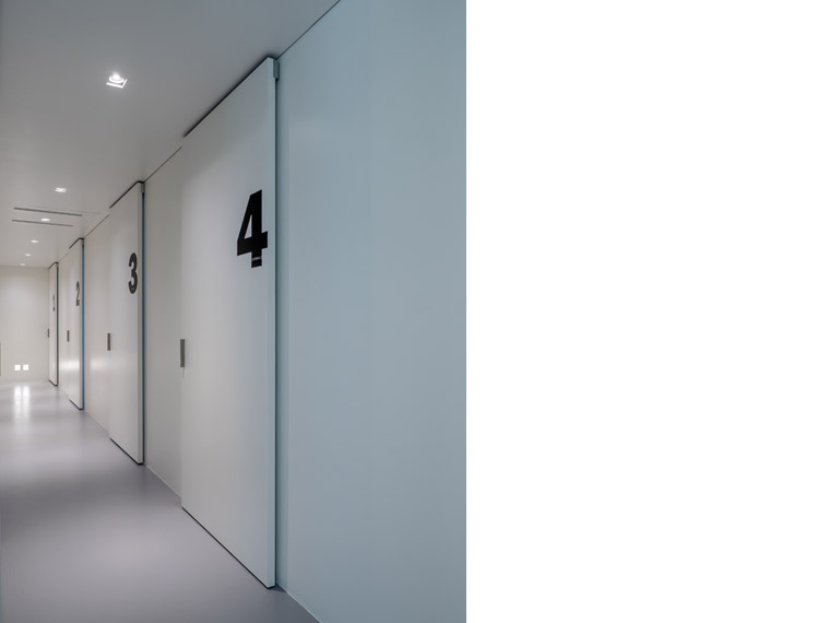
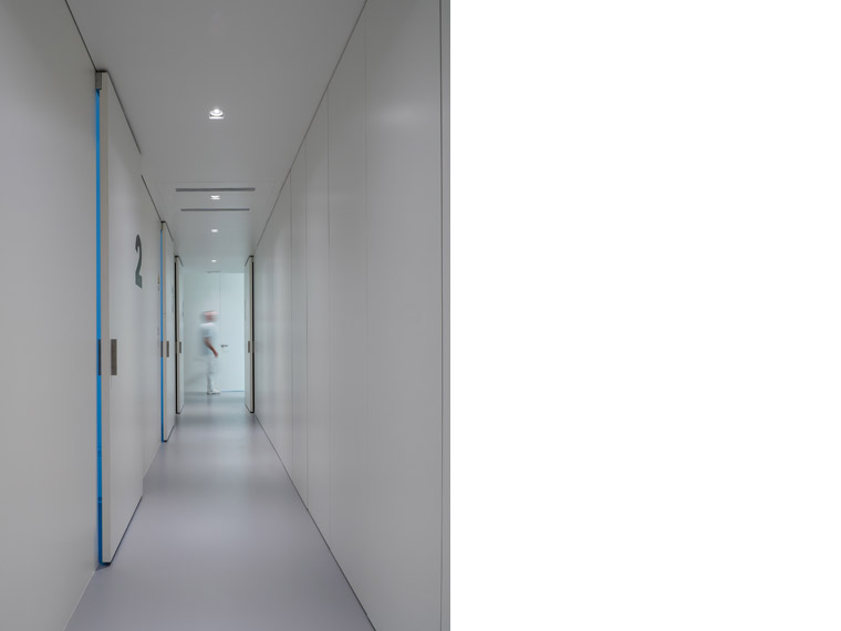
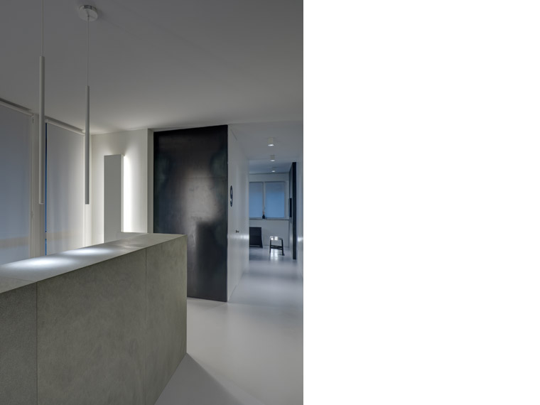
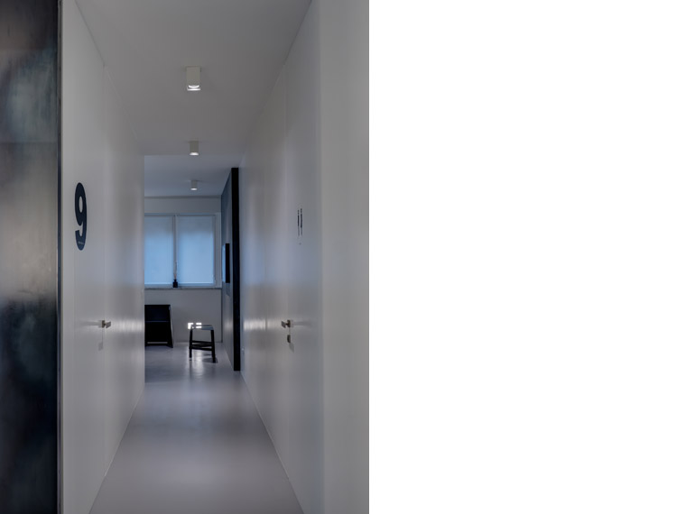
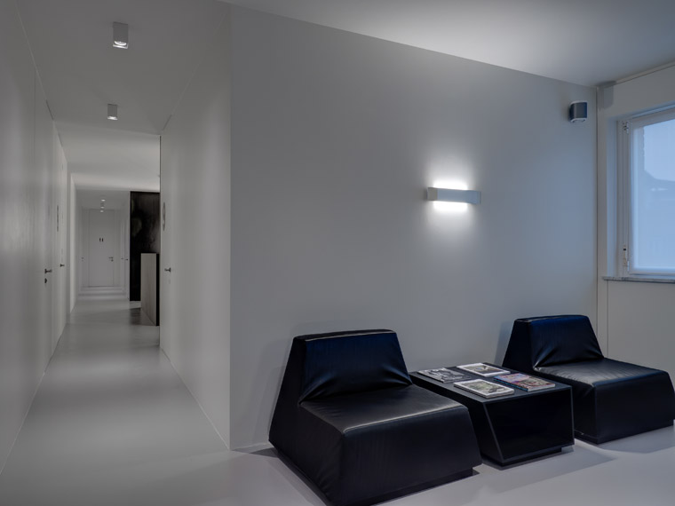
The project has a distribution layout that is built around two orthogonal main axes which distribute the work rooms and administrative areas with a progressive numbering that graphically identifies functions.
The project, although seemingly simple in its linearity and simplicity, is actually highly sophisticated in terms of technological content.
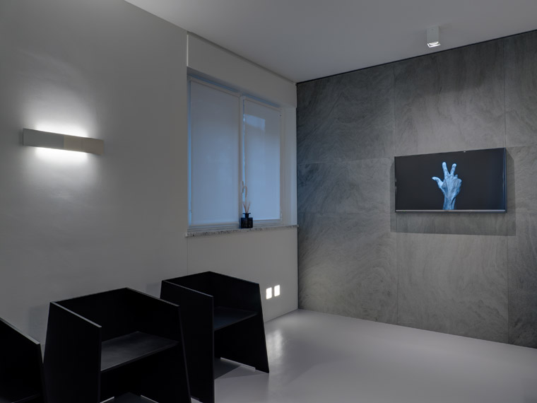
The architectural design, obtained through and sharp colors and lines, gives the space a strong identity aimed to communicate seriousness and professionalism, while maintaining an overall feeling of comfort and hospitality.
Few compositional elements and furniture: along the sides of the corridor they take the form of compact masses designed for storing various professional equipment.
Sharp contrasts in the use of color and materials: white walls are contrasted with the dark gray iron and the warm gray of the stone wall of the waiting room; macro numbers have been applied on the doors flush to the wall in order to indicate in a clear way the function of each room; artistic black and white images of hands flowing on the monitor on the stone wall to indicate how the human approach is still and always a priority of main importance.
Sup. 200mq
Graphic design: Paola Romano

